Feedback from Open Studios
Looking back, one of the most valuable parts of Open Studios wasn’t just showcasing the work—it was the sheer amount of feedback I received from people across different years, disciplines, and even outside visitors. A lot of juniors and classmates commented on how much they enjoyed the interactive nature of the project, especially the falling-letter ASL game, but also pointed out areas where I could push it further. Several people suggested thinking about how the experience could become more intuitive for first-time users—maybe adding quick onboarding instructions, or small visual prompts to guide people through the gameplay. Others encouraged me to think beyond a single game and imagine what a series of ASL-based learning games could look like, building a bigger, more holistic platform. There was also excitement around the plotter experiment, with people wondering if it could become a standalone project—maybe a live drawing machine at exhibitions or a tool for generative storytelling using hand gestures.
The feedback from seniors and alumni was a little more detailed and critical, but in a really constructive way. They encouraged me to think about tying everything together with a stronger visual system—something that could link the digital and physical parts of the project more seamlessly. Abdul Matin suggested that the plotter could be explored even further, not just as a tech demo, but as an artistic tool, perhaps resulting in a series of physical drawings or a short video piece. Aditi and Afiq talked about the importance of refining my UI/UX and thinking about user flow at every step, especially if I want to eventually test the games with actual DHH learners. Hearing all this helped me realise that while the project had strong foundations, there was still a lot of potential growth ahead—ways to polish, expand, and stretch the ideas into even more meaningful experiences. It didn’t feel like an ending; it felt like the beginning of a much bigger path.
Working on a better interface
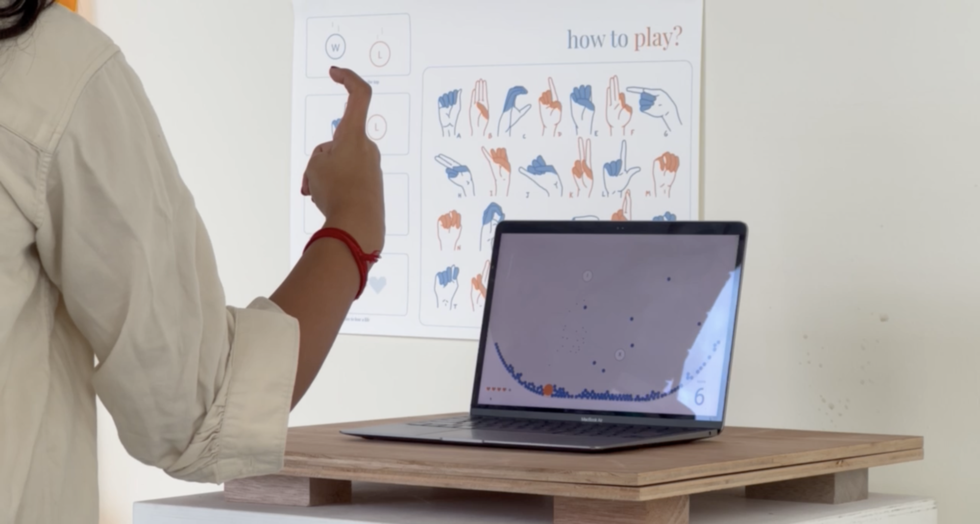
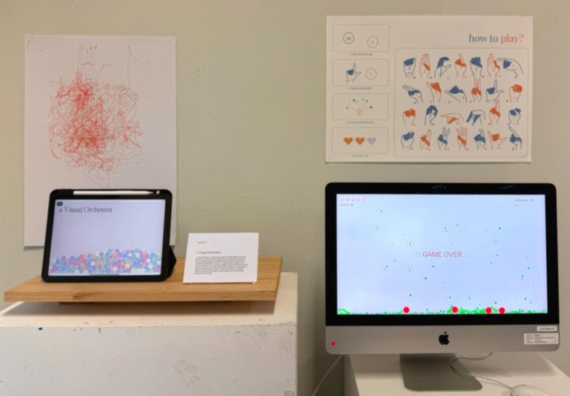
One of the biggest pieces of feedback I kept hearing during Open Studios was about the interface design of my ASL learning game. A lot of people pointed out that while the gameplay itself was fun, the visuals didn’t feel fully integrated with the rest of my project—especially compared to the poster and the physical setup of my booth. Taking that to heart, I started working on a visual refresh. Instead of having the game just use the edges of the browser window as boundaries, I designed a large static bowl shape at the bottom of the screen using Matter.js. Now, when letters fell, they would either get caught in the bowl if they weren’t exploded in time, or bounce around in it if they became inactive. It immediately made the whole experience feel more intentional and tied together. I also updated the colour palette to match the poster—soft neutrals with a pop of orange—and moved the score and lives indicators neatly to the bottom corners of the screen.
I didn’t stop there. I also built a game over animation that filled the bowl with a fading orange overlay when all lives were lost, followed by a “Game Over” message appearing at the center. To make restarting easy, I added a small restart button below the game area that players could click to instantly jump back into a new round. These small details made a big difference—the game finally felt like it belonged alongside the other experiments, instead of feeling like a separate side project. Updating the interface wasn’t just about making it prettier; it made the game easier to understand and more satisfying to play, especially for people who might only interact with it once during an exhibition setting. It felt good to see everything slowly starting to fit together visually, narratively, and interactively.