Cohort Presentation
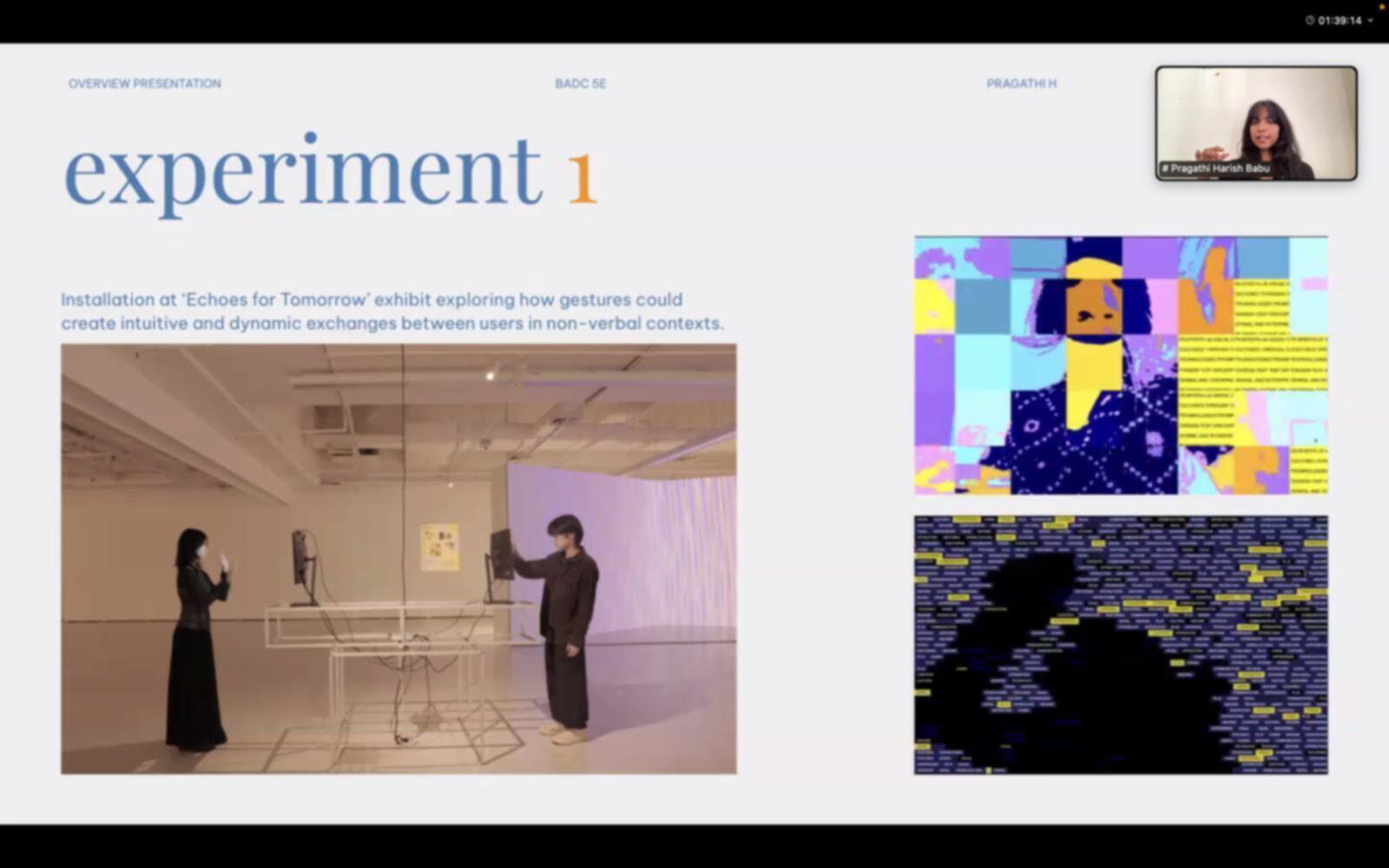
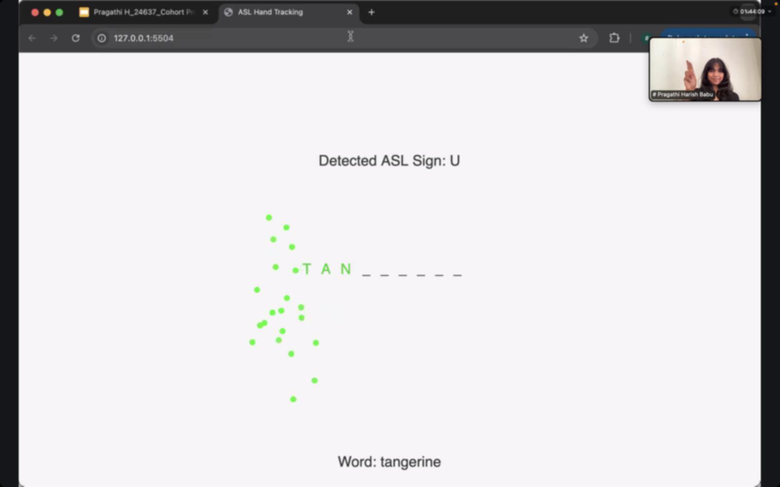
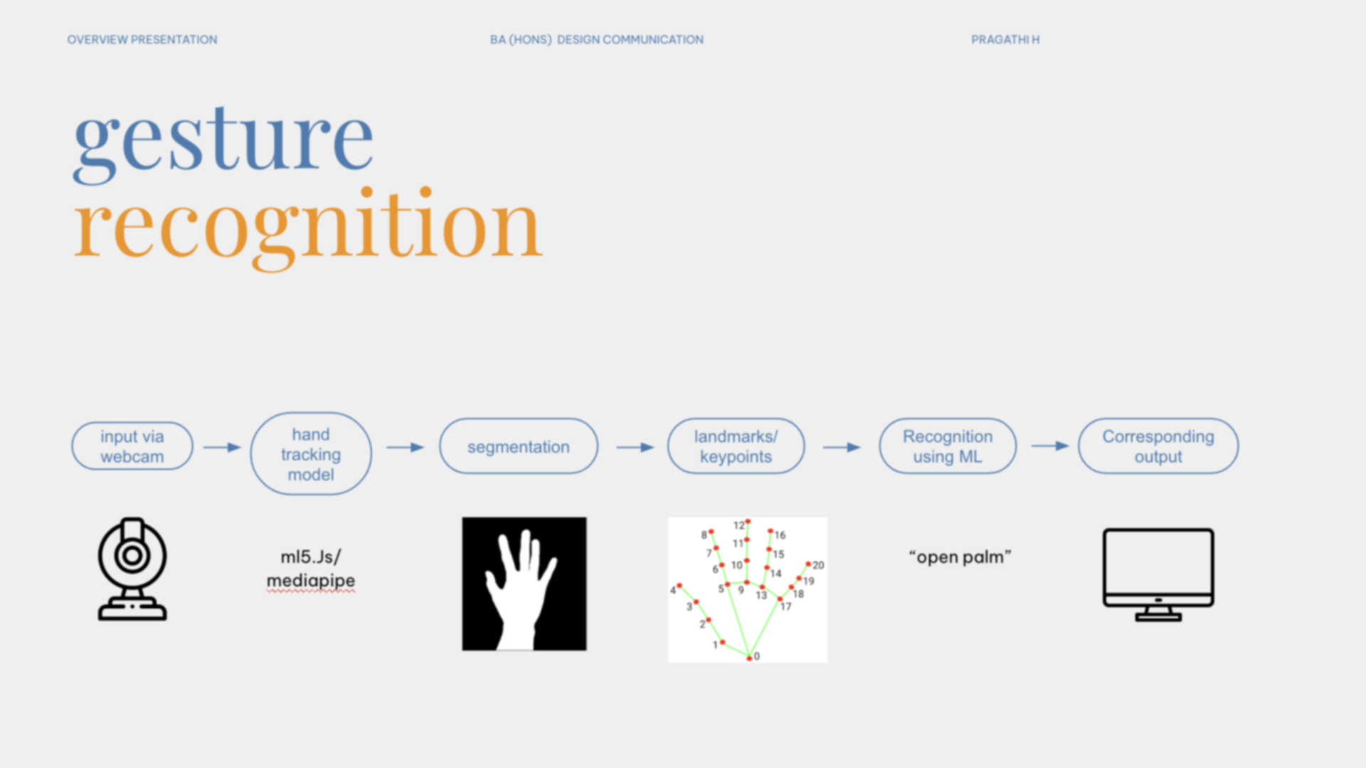
This week, I was selected to represent my atelier and present my graduation project to the entire Design Communication cohort—a mix of all Year 3 students and lecturers across different specialisations. It was both exciting and slightly terrifying. I knew most people walking into the room wouldn’t be familiar with gesture recognition or the tech side of my project, so I had to think carefully about how to make it accessible. I revised my presentation to include a new slide that broke down how gesture recognition technology actually works. I kept it simple—a visual diagram showing the webcam capturing a hand, keypoints being tracked, and data flowing into an interactive interface. I wanted the audience to understand not just what the system does, but how it does it. The challenge was to make something that feels like magic (a machine understanding your hand signs) feel grounded and understandable, without overwhelming anyone.
The presentation went well, and I was grateful for the feedback I received afterward—especially from Andreas and a few other lecturers. They appreciated that I wasn’t just talking about the work, but actually showing what I had built. At the same time, a few pointed out that some of my slides felt too minimal, with only a line or two of text. They suggested integrating more images or screen recordings of the prototypes in action to help the audience follow along, especially when I was describing experiments or sign detection. A couple of people mentioned that my explanation of gesture recognition was clear but could benefit from better visuals—maybe cleaner diagrams or more polished motion graphics. Another helpful tip was about video playback: instead of clicking play mid-presentation (which I got a bit flustered doing), I could set videos to auto-play or consider switching to Keynote for more control. What stood out most was the suggestion to bring back some of the playfulness from my earlier semester experiments into the more structured Phase 2 work. It made me think about how to blur the line between "learning" and "play" again, especially in the UI and game design.
TRANS/mission 2025
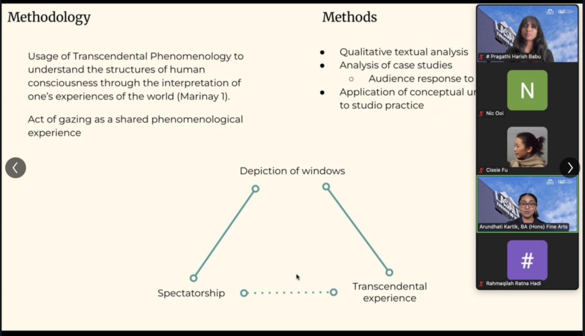
Soon after the cohort presentation, I was honoured (and mildly surprised) to be nominated to present my paper at Trans/Mission 2025, LASALLE’s interdisciplinary conference. My project, Gestural Interactions, was one of four selected from the School of Design Communication to be shared with a wider audience from across the college. In preparation, I spent some time revisiting my presentation and making the improvements suggested during the cohort round—cleaning up the gesture recognition slide, adding actual footage of the experiments instead of just talking about them, and showing both the hand and on-screen output side-by-side. I also thought more carefully about how to frame my transition from playful interaction-based explorations in Semester 1 to the more applied, learning-oriented games in Semester 2. The updated slides felt tighter, more visual, and definitely more conference-ready.
The actual presentation experience, though, felt a bit anticlimactic. The audience was polite, but there weren’t any questions afterward, and I wasn’t sure how much of what I said really landed. The room felt more like a formality than a space for conversation—which, to be fair, happens sometimes with academic presentations. Still, it was a good reminder that just because something is interesting to me doesn’t mean it will automatically resonate with everyone else, especially in a room of people from such varied disciplines. That said, it was still meaningful to be part of the lineup and see the kinds of work happening in other faculties—there were installations, performances, musical scores, and research projects I wouldn’t have encountered otherwise. It helped me place my work within a bigger picture of creative research and made me reflect on how I might present more accessibly and energetically next time.